CSS:瀑布流布局实现方式

1. 传统多列浮动

  1. 各列固定宽度,并且左浮动;
  2. 一列中的数据块为一组,列中的每块依次排列;
  3. 更多数据加载时,需要分别插入到不同的列中。
1
2
3
4
5
6
7
8
9
10
11
12
13
14
15
16
17
18
19
20
21
22
23
24
25
26
27
28
29
30
31
32
33
34
35
<!DOCTYPE html>
<html lang="en">
<head>
<meta charset="UTF-8">
<title>瀑布流布局</title>
<style>
.container {
width: 160px;
float: left;
}
.item {
background-color: #90EE90;
margin: 5px 5px 5px 5px;
}
</style>
</head>
<body>
<div class="container">
<div class="item" style="height: 230px">1</div>
<div class="item" style="height: 100px">2</div>
</div>
<div class="container">
<div class="item" style="height: 100px">3</div>
<div class="item" style="height: 300px">4</div>
</div>
<div class="container">
<div class="item" style="height: 250px">5</div>
<div class="item" style="height: 200px">6</div>
</div>
</body>
</html>

  • 优点:布局简单,应该说没啥特别的难点;不用明确知道数据块高度,当数据块中有图片时,就不需要指定图片高度。
  • 缺点:列数固定,扩展不易,当浏览器窗口大小变化时,只能固定的x列,如果要添加一列,很难调整数据块的排列;滚动加载更多数据时,还要指定插入到第几列中,还是不方便。

2. CSS3 样式定义

1
2
3
4
5
6
7
8
9
10
11
12
13
14
15
16
17
18
19
20
21
22
23
24
25
26
27
28
29
30
31
32
33
34
35
36
37
38
39
40
41
42
43
44
45
46
47
48
49
50
51
52
53
54
55
56
57
58
59
60
61
62
<!DOCTYPE html>
<html lang="en">
<head>
<meta charset="UTF-8">
<title>瀑布流布局</title>
<style>
.container{
-webkit-column-width:160px;
-moz-column-width:160px;
-o-colum-width:160px;
-webkit-column-gap:1px;
-moz-column-gap:1px;
-o-column-gap:1px;
}
div:not(.container){
-webkit-border-radius:5px;
-moz-border-radius:5px;
border-radius:5px;
background:#90EE90;
border::#CCC 1px solid;
display:inline-block;
width:157px;
position:relative;
margin:2px;
}
.title{
line-height:80px; font-size:18px; color:#999;
text-align:center;
font-family:"Microsoft YaHei";
}
</style>
</head>
<body>
<div class="container">
<div style="height:80px" class="title">纯CSS3瀑布布局</div>
<div style="height:260px"></div>
<div style="height:65px"></div>
<div style="height:120px"></div>
<div style="height:145px"></div>
<div style="height:90px"></div>
<div style="height:145px"></div>
<div style="height:160px"></div>
<div style="height:65px"></div>
<div style="height:230px"></div>
<div style="height:140px"></div>
<div style="height:85px"></div>
<div style="height:20px"></div>
<div style="height:145px"></div>
<div style="height:50px"></div>
<div style="height:65px"></div>
<div style="height:230px"></div>
<div style="height:140px"></div>
<div style="height:85px"></div>
<div style="height:20px"></div>
<div style="height:145px"></div>
<div style="height:50px"></div>
<div style="height:145px"></div>
<div style="height:160px"></div>
<div style="height:240px"></div>
</div>
</body>
</html>

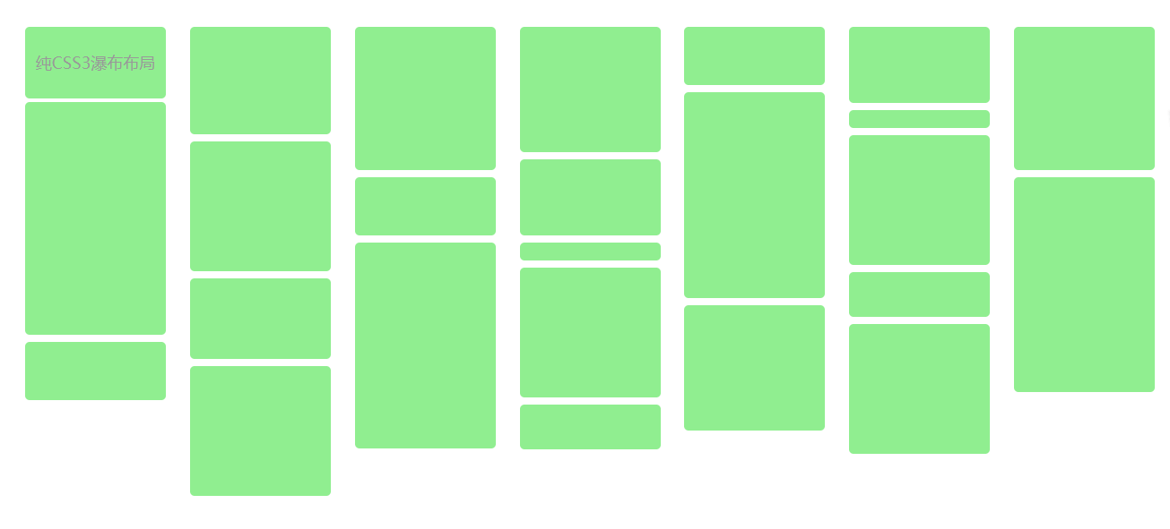
  • 优点:直接 CSS 定义,最方便了;扩展方便,直接往容器里添加内容即可。
  • 缺点:只有高级浏览器中才能使用;还有一个缺点,他的数据块排列是从上到下排列到一定高度后,再把剩余元素依次添加到下一列,这个本质上就不一样了;

鉴于这两个主要缺点,注定了该方法只能局限于高端浏览器,而且,更适合于文字多栏排列。

3. 绝对定位

思路:

  1. 数据块排列(对容器中已有元素进行排列),算法步骤简述下:
    设置(块元素宽度一致)
  • 初始化时,对容器中已有数据块元素进行第一次计算,需要用户给定: a,容器元素 — 以此获取窗口总宽度; b,列宽度(块元素宽度); c,最小列数;
  • 计算显示列数:窗口宽度除以一个块框宽度向下取整,并设置waterfall显示的居中
  • 存储每列的高度
  • 获得列数后,需要保存每个列的当前高度,这样在添加每个数据块时,才知道起始高度是多少;
  • 依次取容器中的所有数据块,先寻找当前高度最小的某列,之后根据列序号,确定数据块的left,top值,left 为所在列的序号乘以列宽,top 为所在列的当前高度,最后更新所在列的当前高度加上这个数据块元素的高度,至此,插入一个元素结束;
  • 当所有元素插入完毕后,调整容器的高度为各列最大的高度值,结束依次调整。
  1. 异步加载数据,包含两个步骤:
  • 绑定滚动事件,并确定预加载线高度值,即滚动到哪个高度后,需要去加载数据,其实这个就是列的最小高度值,这样当前滚动值和最小高度值比较一下即可判断出来,是否要触发加载数据;
  • 加载数据,函数传参,能提供加载数据函数和停止加载(加载多少时停止)函数,以更方便的控制。
  • 优点:最优的一种方案,方便添加数据内容,窗口变化,列数/数据块都会自动调整;方便添加数据内容,窗口变化,列数/数据块都会自动调整;
  • 缺点:需要实现知道数据块高度,如果其中包含图片,需要知道图片高度;JS 动态计算数据块位置,当窗口缩放频繁,可能会狂耗性能。
坚持原创技术分享,您的支持将鼓励我继续创作!

热评文章